A sorted bar chart can make a small dataset easier to read while hiding the context needed to interpret it. The accompanying counts may describe different populations, an aggregate may not be the mean of the rows shown, and a blank field can disappear when converted to zero. This tutorial uses Matplotlib to keep those distinctions visible without encoding them as statistical confidence.
The example is a historical June 2026 Dubai community snapshot. Its purpose is to teach plotting and data handling, rather than to recommend properties or interpret current market conditions. The same approach works with other small tables containing a measurement and several coverage counts.
Inspect the columns before plotting#
The public dataset repository has 12 community rows and a separate city row. Its CSV uses community, slug, gross_yield_pct, buildings_tracked, yield_sample_size, and source_url. The accompanying README defines yield sample size as the number of buildings with sufficient rent and sale evidence. It is distinct from the number of buildings tracked.
For example, International City reports a gross yield of 9.98%, 358 buildings tracked, and a yield sample size of 220. Remraam reports 9.43%, 94 buildings tracked, and a yield sample size of 94. These are different coverage situations even though a yield-only chart would give them identical kinds of bars.
The city row reports 8.16% and 2,561 buildings tracked, but its yield sample size is blank. Preserve that missing value. Substituting zero would assert something the file does not say; substituting the tracked count would confuse two different fields.
The percentage column already contains percentages: 9.98 means 9.98%, so it must not be multiplied by 100. Gross yield describes annual rent divided by property price, before costs. It is not net return.
Make the data and code reproducible#
This example pins the CSV to a repository revision instead of downloading whatever happens to be on main. That preserves the exact input used for the figure. The dataset remains in its existing repository; this contribution does not redistribute or change its licence.
Save plot_context.py beside this post and install Matplotlib in a separate environment:
python -m venv .venv
source .venv/bin/activate
python -m pip install matplotlib==3.11.2
python plot_context.py
The complete script downloads the public CSV, validates the needed column names, converts numeric strings, and renders coverage-context.png. It was run with Python 3.12 and Matplotlib 3.11.2. The only missing numeric value in this snapshot is the city yield sample size, which the parser represents as None.
Its missing-value conversion is explicit:
sample = raw["yield_sample_size"].strip()
sample_value = int(sample) if sample else None
The full script keeps the city row outside the list of communities before sorting. Sorting uses descending yield and then the community name, so ties such as the two 9.04% rows have a deterministic order.
Align two panels instead of mixing units#
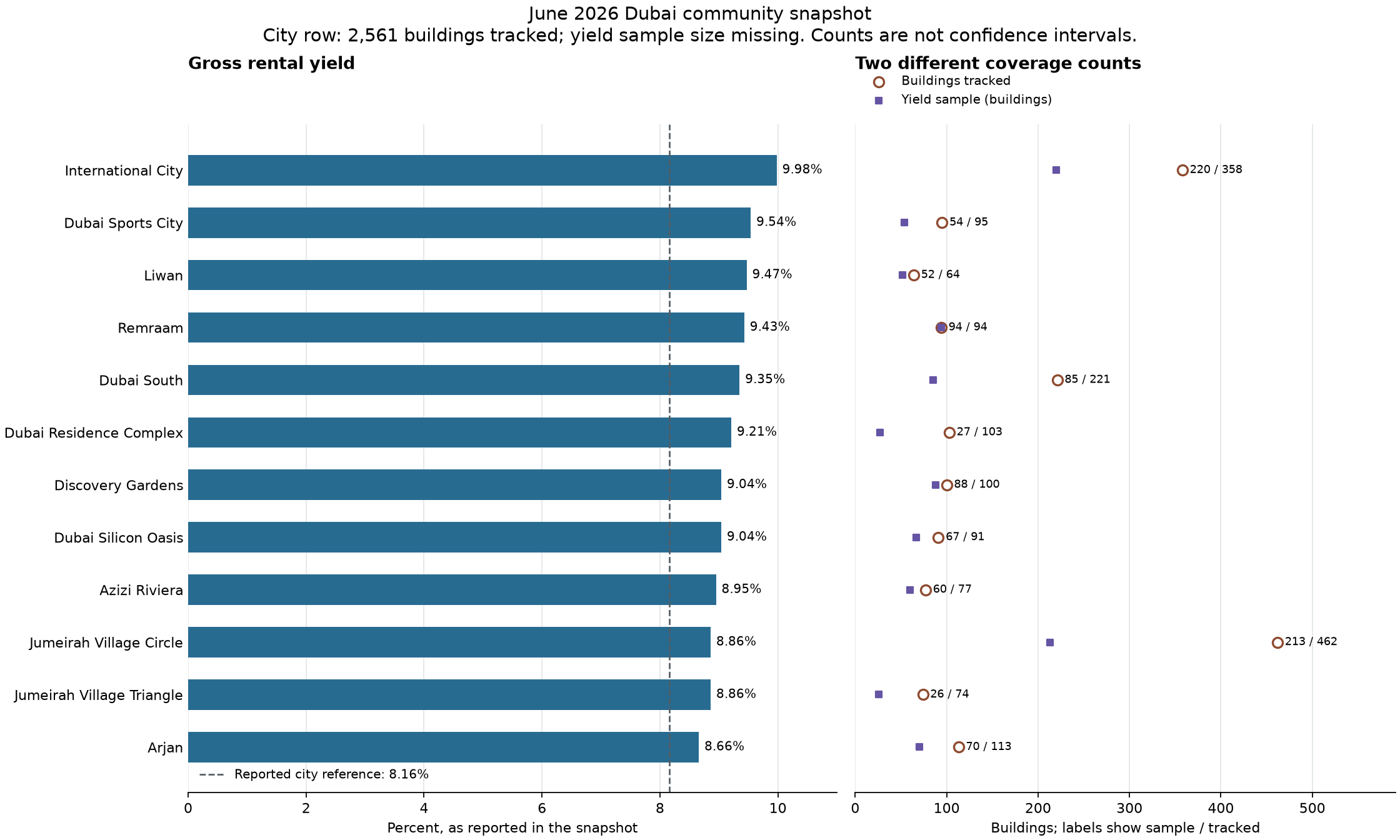
The yield panel starts at zero. Each bar has a numeric label, so the reader need not estimate close values from length alone. A dashed vertical line marks the separately reported city reference. It is not calculated from these 12 rows.
The count panel uses its own horizontal scale and shares the same vertical positions. Filled squares and open circles distinguish the two counts even without relying entirely on colour. Text labels show sample / tracked; they are two counts, not a computed ratio. The script plots sample markers only for rows with a known sample size.
Matplotlib’s horizontal bars and shared axes make the alignment straightforward:
fig, (yield_ax, count_ax) = plt.subplots(
    1,
    2,
    sharey=True,
    layout="constrained",
    gridspec_kw={"width_ratios": [1.2, 1]},
)
Both panels receive the same integer row positions. Calling invert_yaxis() once puts the first sorted community at the top of both shared axes. The two horizontal scales remain separate because percentages and building counts have different meanings.
Keep the interpretation within the evidence#
The 8.16% city reference is not the unweighted mean of the 12 selected community values, which is about 9.20%. Recomputing it from this selection would silently change the reported statistic. The dataset also does not provide the underlying observations, dispersion, or weighting needed to infer confidence intervals or reproduce its city aggregation.
A larger reported sample is therefore context, rather than proof that a displayed yield is more precise. Neither count should be used as an error bar. The figure preserves what is known and explicitly names what is missing.
This pattern is useful whenever a table mixes measurements with counts: preserve the source’s units, keep aggregate rows separate, make missing values explicit, and align supplementary information without pretending that it quantifies uncertainty.
Source, affiliation, and contribution licences#
The example dataset was published by dataHabibi, which is also the contributor’s company affiliation. This is a newly authored educational example, not a description or release of the company’s production plotting code. The draft and code were prepared with AI assistance; the code was executed and its output checked against the pinned public CSV.
The newly contributed tutorial text and figure are offered under CC BY 4.0 and the newly contributed Python code under BSD 3-Clause, as required by this blog. Those contribution licences do not apply to the source dataset: its repository currently has no explicit dataset licence declaration. Readers should consult that repository’s terms and obtain permission for reuse where needed.